Here are 8 recommendations to help you create perfect cards. The Ultimate guide to better cards. Cards are these little UI components we see everywhere and the reason is simple, they take really little space and show you enough information and usually 1-2 options you can choose from.
Rule 1: Clear block structure
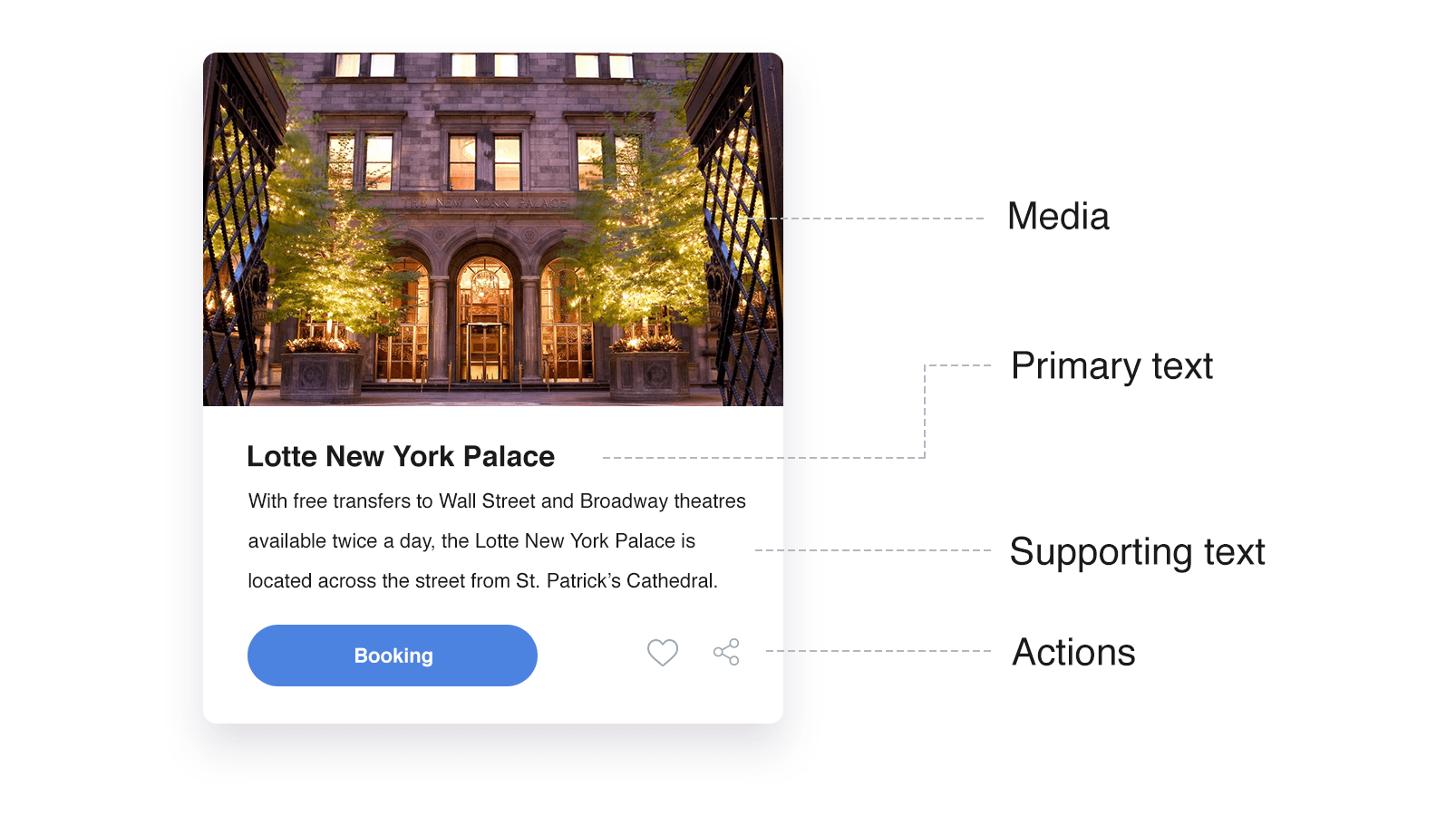
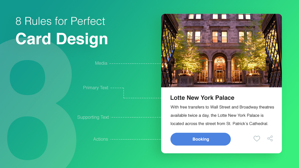
Cards are digital analogues of physical cards featuring information and control panel. The example below consists of visual description(media), title, supporting text and control buttons.
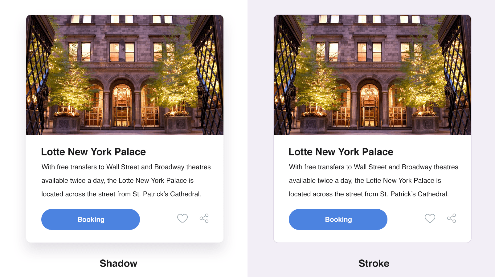
Rule 2: Shades and outlines
Use shades and outlines to make the card stand out against the background and other content.
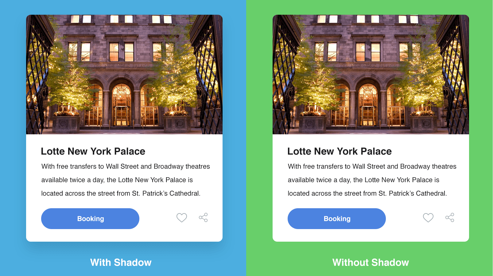
Rule 3: Choose appealing background
Card background should be appealing and not distracting. Cards in light colors against dark background look bright and effective, and in most cases, there is no need for shades and outlines.
Rule 4: Font size and thickness
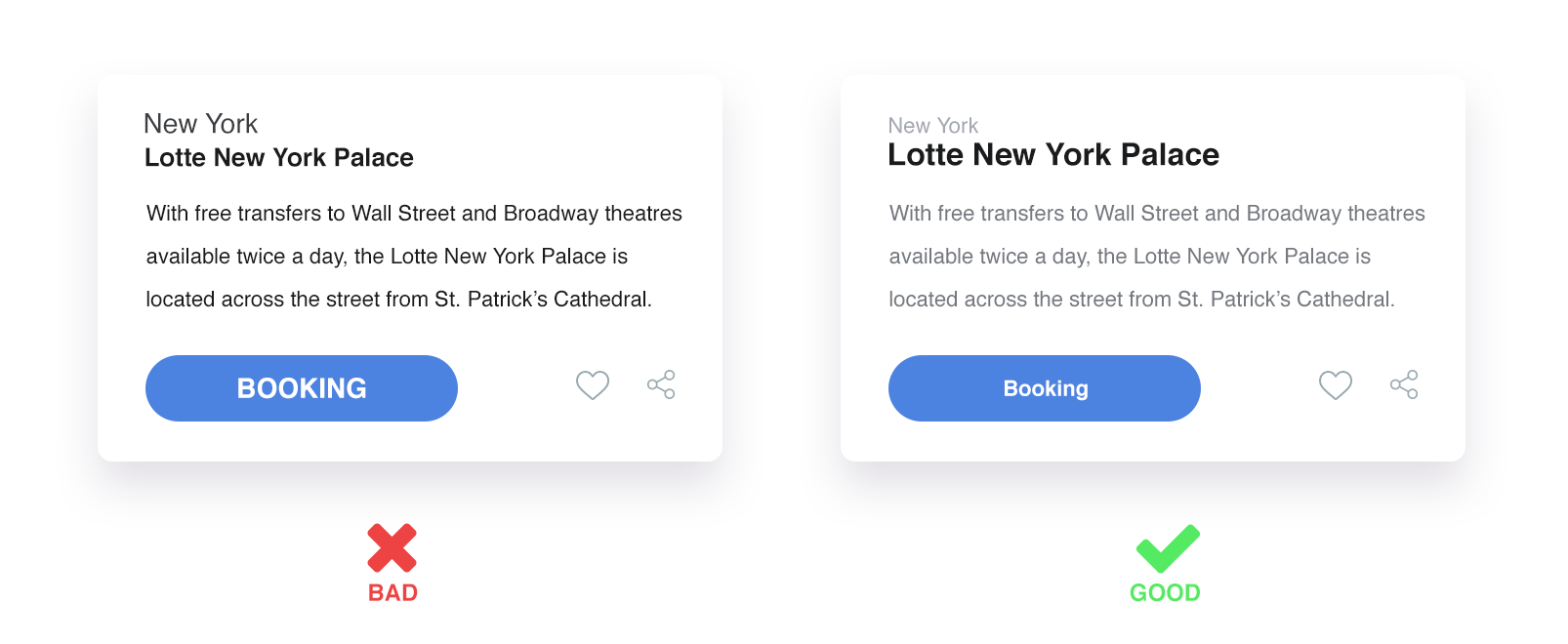
Users prefer reading more in small font size. Font size and style affect significantly interface convenience and aesthetics.
In the example below the title is emphasized, while the card description is in smaller and thinner font. This allows the user to get the point of the card at once.
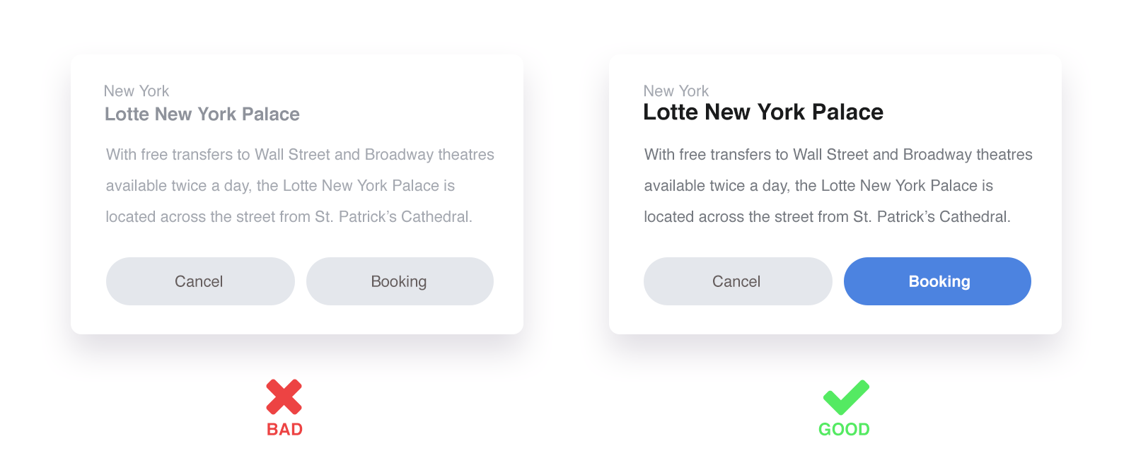
Rule 5: Contrast
Cards are the smallest of the elements; thus, contrast is very important as it helps to prioritize.
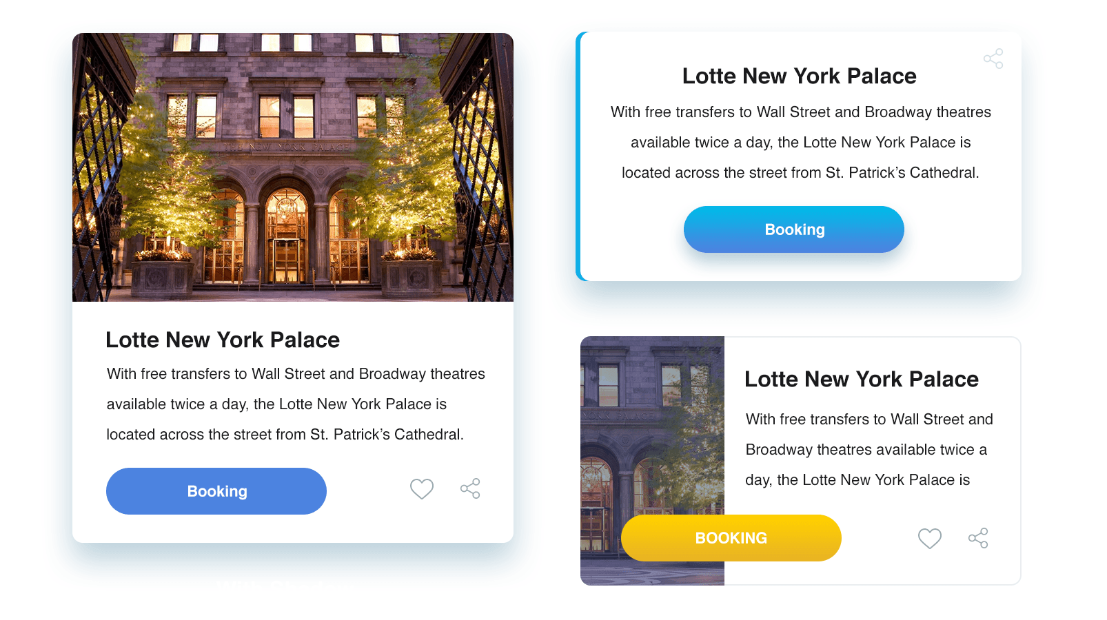
Rule 6: Buttons
You can use different types of buttons on your cards – usual buttons, text buttons, etc. In vertical cards the buttons can be placed in the center, in the bottom, or on the right or left side. Choose the location that best suits your design.
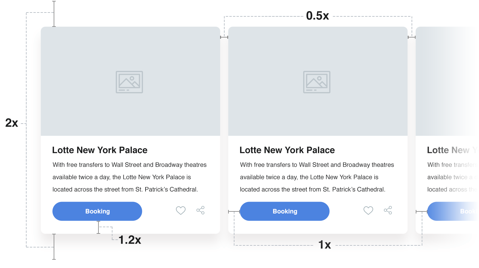
Rule 7: Indents and intervals
Use indents between emphasized elements. Leave enough space while grouping information on the card. The example below is relevant for most cases. Instead of the «X» put the numbers you need to calculate the indent size.
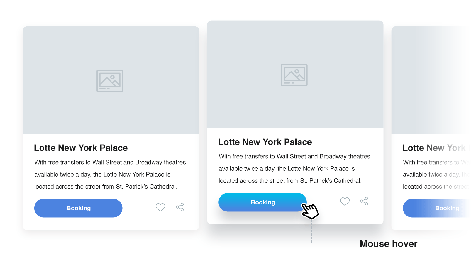
Rule 8: Focus and cursor pointing
To make your design interactive, use darker shades on cursor pointing or change certain elements in the card. There are no ready answers here, as everything will depend on your UI.
Best regards
Perfecto Web

 Русский
 English