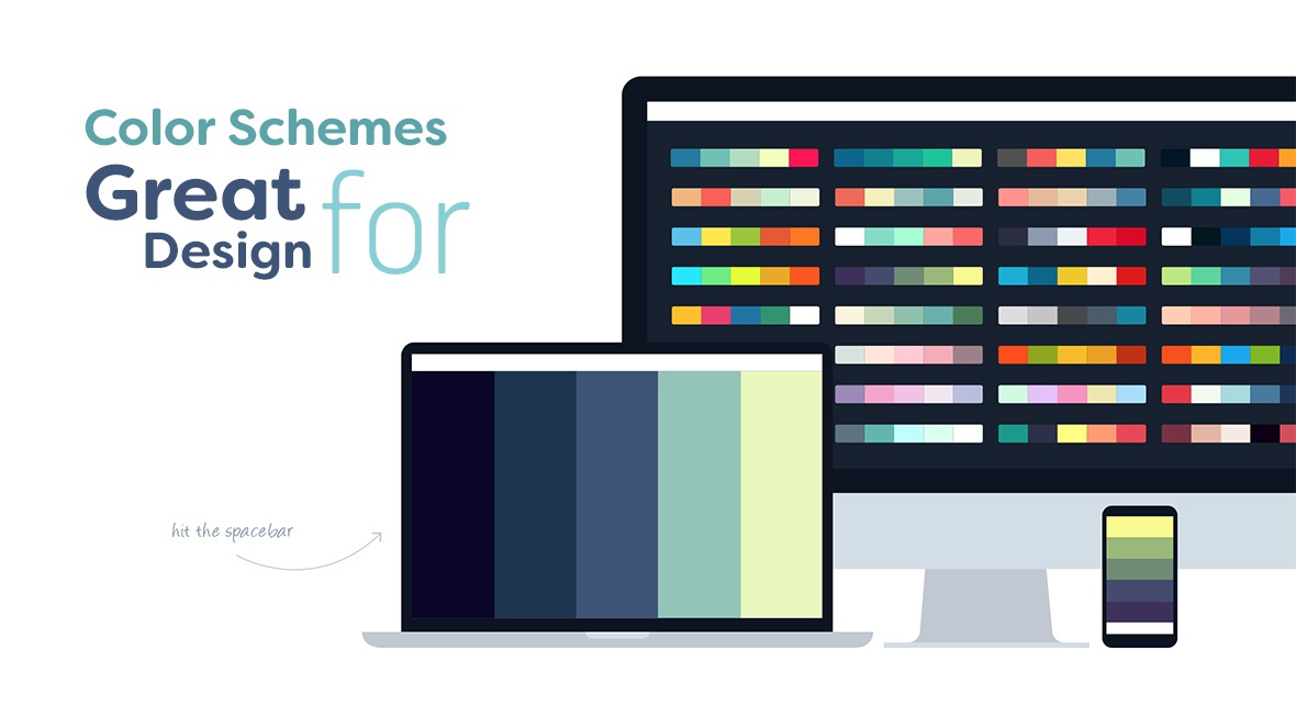
One of the most common mistakes made by novice designers is overusing of colors in designing websites, brochures, banners, etc.
This has a simple solution – just choose different shades of a couple of colors instead of using many different colors. This article will give you some examples of successful color selections.
The Color Scheme Affects Content Perception
The color palette is one of the main first impression creators. Whether your work conveys the energy of the club, the sense of comfort, the New Year mood, whets the passerby’s appetite or not, depends mostly on the color palette you choose. Right color selection is one of the most difficult stages in designing. The right color palette will help you convey your content most effectively.
Colors affect our mood and perception. They attach certain context to the content. Many years of research in psychology and marketing, which have become tightly interconnected in the past decade, prove this. Therefore, the right color scheme helps to convey your message to the audience most effectively. It is also important not to use too many colors.
This article has useful tips both for novice and experienced designers.
Here are small rules before going to the main points:
- It’s best to use 2-3, maximum 4 colors in one design, two as dominant, and others as additional.
- If you still feel like using more colors, try using their shades instead.
- Leave enough free (in particular white) space not to tire the eyes.
Here are some tips on how to choose the ideal color scheme for your design.
1. Use the colors of the brand
While creating a design for a particular brand, use its colors as dominant ones. Use one or two additional colors if you wish. Below are two examples of infographics for famous brands.

OREO - Blue is the main color, while black and its shades are additional.
Coca-Cola - Red is the main color; black and different shades of red are additional
How to choose additional colors?
To do this, you will need an easy-to-use generator. You can find one in Adobe Color CC. There are also many online tools you can use to create color schemes, like Coolors, which is quite quick, convenient and absolutely free.
How to choose the shades?
You can choose the shades for any color using Coolors or Adobe Color CC. If you prefer to choose the shades yourself, you can do it in Color Picker like shown in the picture below.

Color scheme based on the colors of the logotype
Using the colors of the logo enhances the brand’s recognition and ensures your work’s success and client’s trust.
2. Choose the Color Scheme based on the Content
Such approach will create the content image in a couple of seconds. For example, to create the image of coffee, use the colors and color shades of coffee. Also, try to stick to the colors of the brand. To make your design more expressive, use additional colors and color shades.
You can use Adobe Color CC (former Adobe Kuler) to help you select colors. The program will offer you a wide range of solutions based on your main color. There are also many online tools that can help you select colors.
Select the colors so, that your product stands out and catches attention, as black Helvetica font would stand out on white paper. The surrounding design and graphics should help, not hinder the content perception.
3. Be inspired by nature and natural colors
Another trick is to use “noble colors”, which will be perceived quickly and easily. For example, if your design has to do with a particular season, use the colors of the season. Just go for a walk and feel what surrounds you. Or, maybe your design is connected with Dubai. What are your associations of Dubai? Desert and yellow sand? The sun and the clear sea? Go on! You already have a wide specter of colors and their shades to use.
Below is the list of colors for each season to inspire you. You can choose1-2 main colors from the list and select additional colors and shades for them. Try not to overuse the colors! Just select shades of the main colors and start creating.
Autumn

Winter

Spring

Summer

Holiday colors
Below are examples of some holidays-associated colors.

The seasonal color selection method works best for banners, infographics, etc., that have to do with a particular period of time. When you use the colors associated with the particular season or holiday, you create the atmosphere of the season or the holiday, which makes your design most expressive and effective.
Conclusion
Choose the color schemes for your projects based on these three principles:
- Stick to the colors of the logotype or the brand for which you are designing.
- Let the content determine the color selection.
- If your design is connected with a particular season or a holiday, use the colors of the season or the holiday
Feel free to experiment and follow your preferences! Get inspired, create and subscribe to our blog to get new inspiring articles!
Wish you success and all the best!
 Русский
 English