Imagine you are going to have an important event soon – an advertising campaign for a product and you need a poster for it. You have already ordered the poster and you like it. But still you have doubts. Will the poster attract big audiences or not? Worry not! In this article we are going to discuss some important nuances to help you always be at the highest level.
Information is the Key Component
Make sure the information you provide is concise, succinct and clear. No one wants to read posters with too much information, find in the thousands words the information. Most people will ignore such posters. It is the designer’s work to present the essential information in a succinct and clear way.
Catchy Headings
The heading is the first thing people look at. Headings must be catchy, short and even intriguing. Very often it depends on the heading whether people will go on to read the content or not.
It is very important to visually separate headings and subheadings and to introduce the key information in the right format. Look at the posters below. They are catchy, bright and render the information immediately.

Details
Make sure to include all the necessary (but only most important details), but be careful not to overload the poster with information. The details may include phone numbers, addresses, and key features of the event. Below are examples of two posters one of which is overloaded with information.

Make sure to include all the necessary (but only most important details), but be careful not to overload the poster with information. The details may include phone numbers, addresses, and key features of the event. Below are examples of two posters one of which is overloaded with information
And is the information about free coffee and cakes so important to highlight it? Let it be a small surprise for your guests!
Call to Action
A successful poster should contain a call for an action; that is it should excite and motivate for an action – to buy a ticket, to make a call to your company, go to the café, etc.
I think it is easy to guess what the poster bellow calls for.

Typography Hierarchy
Now, when we have done with the information, let’s think where and how to put it, following the hierarchy method. First of all, let’s make clear what hierarchy is and why we need it.

The three main levels in the typography hierarchy are shown in the picture below.

Such hierarchy is harmonious and easy to perceive. It renders the information quickly and deep into the conscience. Below is a poster with a wrong hierarchy, which makes it hard to read and perceive.

Stand out!
The chances are your poster will be hanging among many others and competing with them for the attention of the audience. So help your poster stand out! Make it bright and catchy! Don’t let other posters steal the attention of the audience!

Photos
Cool, quality photos make your poster visually rich and respectable-looking. They are one of the simplest ways of attracting audience’s attention. People associate the images with the real life and the brain quickly perceives the information.
Here are some tips on choosing photos:
- Choose photos that visually enlarge the space;
- Find photos that add to the text and don’t damage its readability.

As we can see on the left poster, the picture makes the text hard to perceive.
Illustrations
Graphic images are widely used in design. Usually they are kind animated cartoon images which create the feeling of comfort and trust. Graphic images should always match in color with the colors of the poster. Even if you want them to stand out on the poster, always keep the color balance.
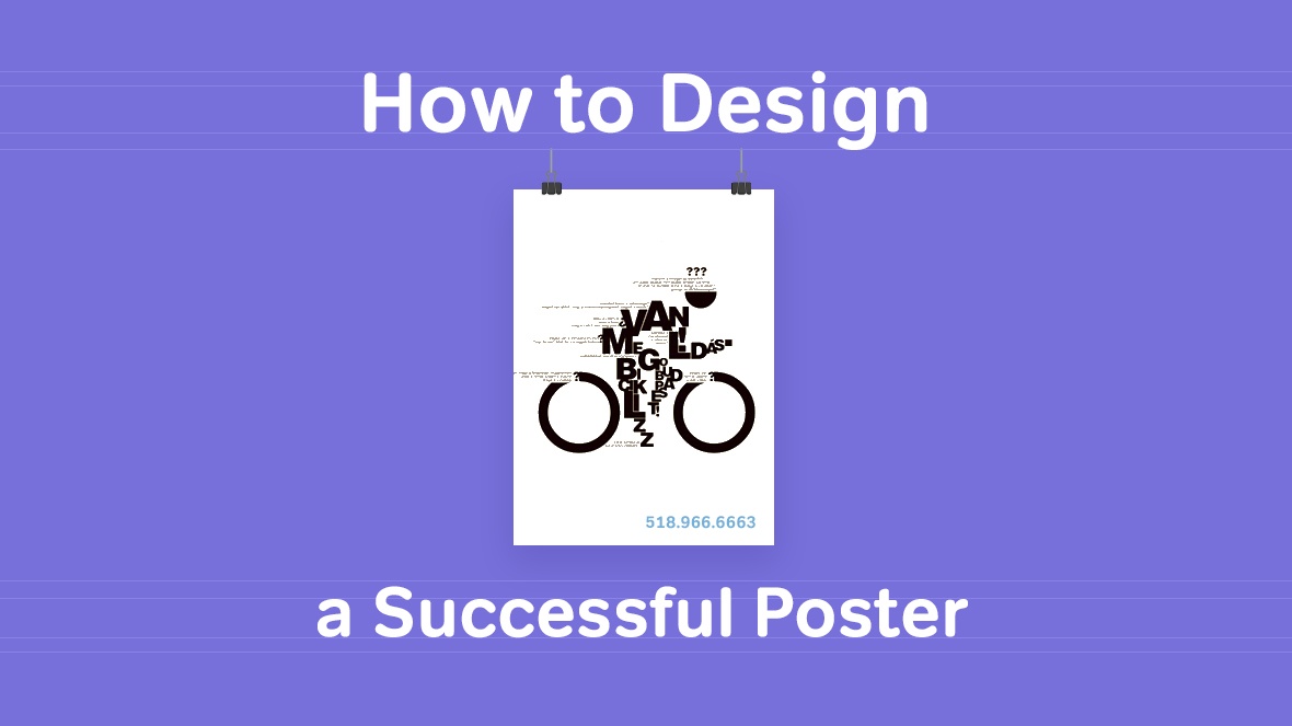
Typographic
Typographic is widely used to emphasize the main content. This minimalistic method is quite effective. One of successful methods of emphasizing the main idea effectively is showing the main text through a mask which in its turn reflects the idea behind your poster.

What this poster wants to tell us is obvious without words – Black Friday books sale with 75% discount.
This is all for this time. Subscribe and follow us for new and useful articles!
Best Regards,Perfecto Web team

 Русский
 English