Perfecto Web team has made a list of most common mistakes in the design of mobile apps and mobile versions of websites for you. Grab some tea and cookies and let’s start!
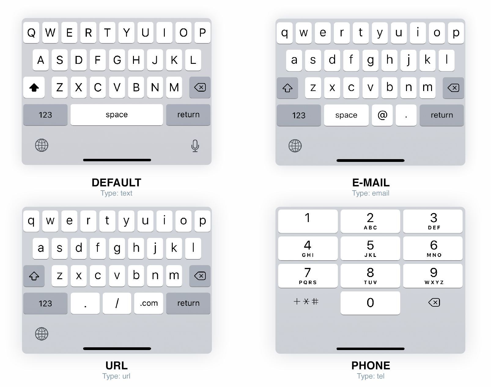
Mistake №1: Displaying the wrong keyboard
Typing on a mobile device can cause some inconvenience due to its small screen and keyboard. However, there are ways to make data entry on mobile devices way easier.
Many popular operating systems offer several keyboard options. If you choose the right field type, the system will open the right keyboard for you. Most page makers use the field «text» to input a text. There are also fields «phone», «email», «url». Below are examples of 4 keyboard types:
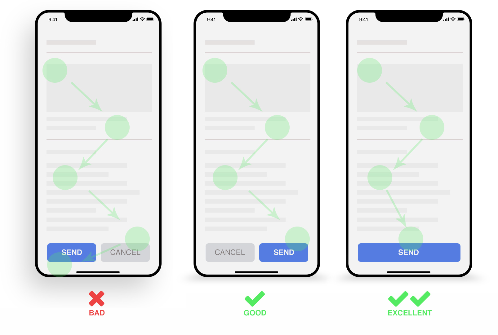
Mistake №2: Not realizing the importance of mobile buttons placement
The right placement of buttons, especially СТА, helps save user’s time and increases brand loyalty. Most users “scan” the mobile interface from top to bottom, therefore it’s better to place the buttons in the bottom of the page.
From the image bellow, which illustrates how the eyes scan the screen, we can conclude that the best place for CTA button is the right bottom part. If there is only one button, it should be placed along the whole length of the bottom part.
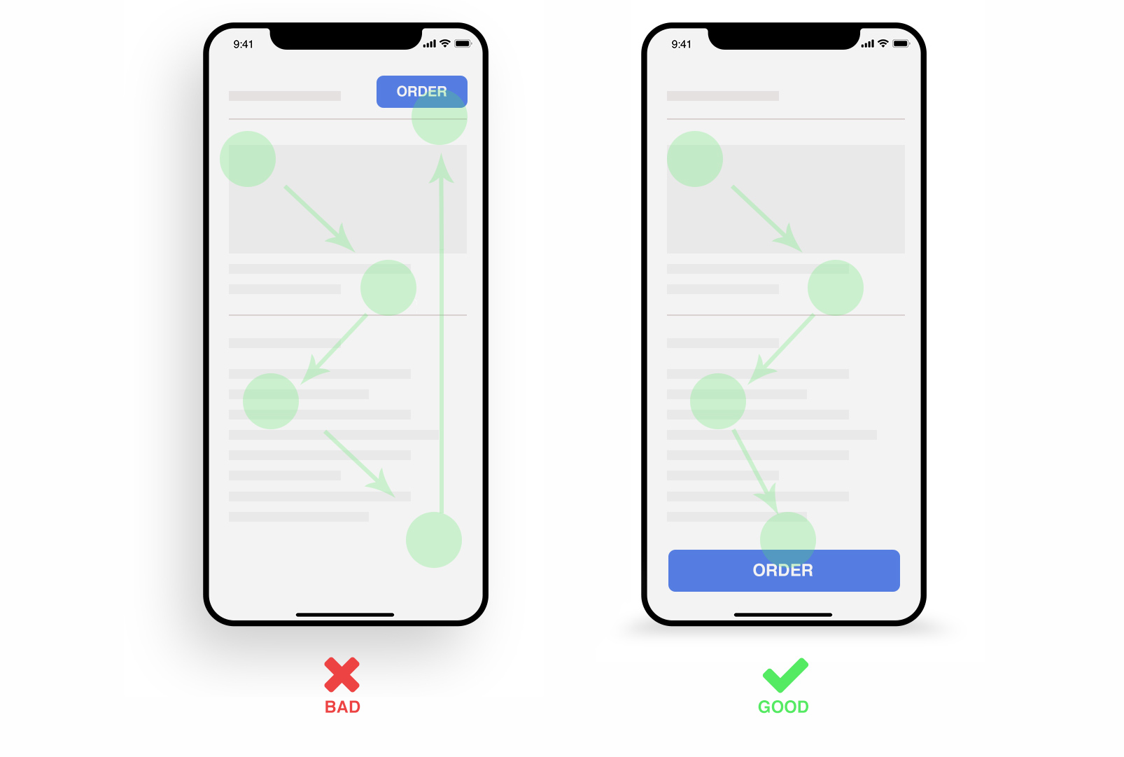
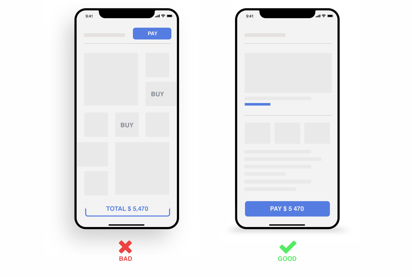
Mistake №3: Wrong position of СТА button
Very often web pages have an CTA button on the top right side. With mobile versions it’s better be placed in the bottom part and be eye-catching, e. g. by placing it along the whole length of the bottom part, as shown below.
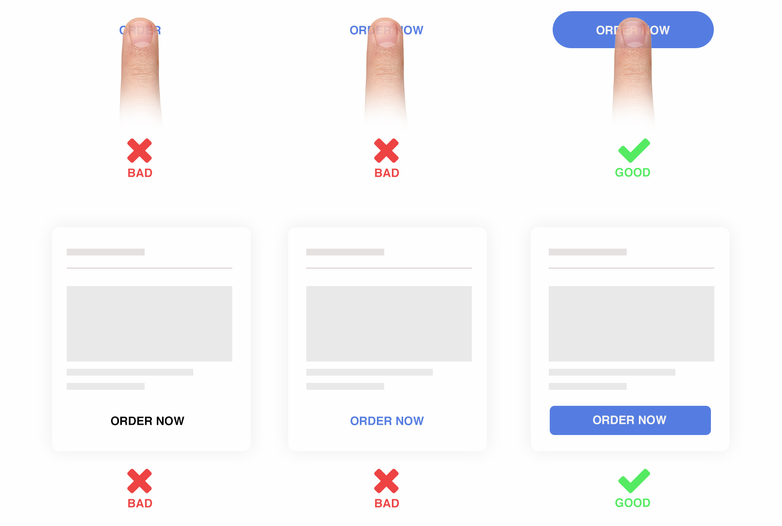
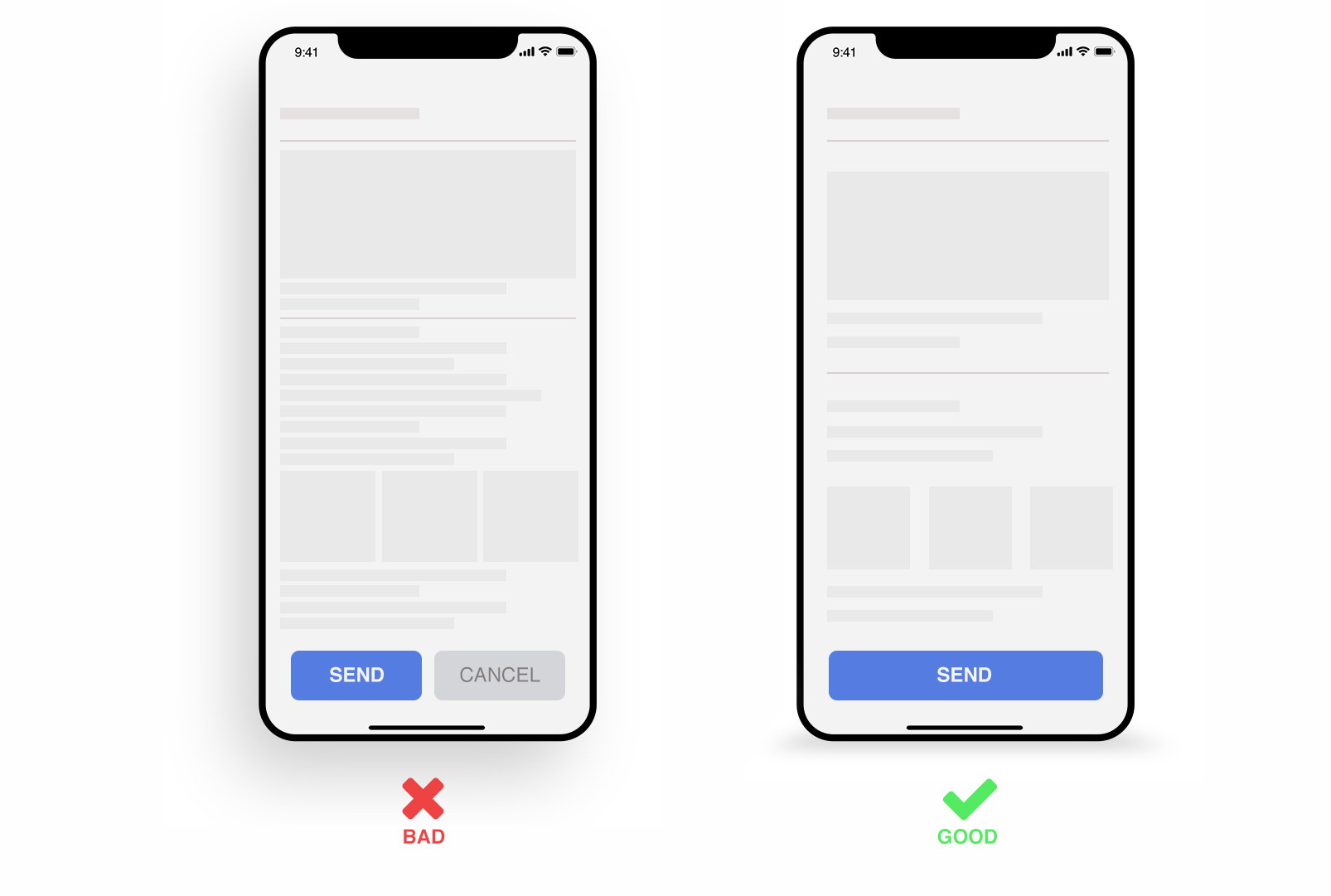
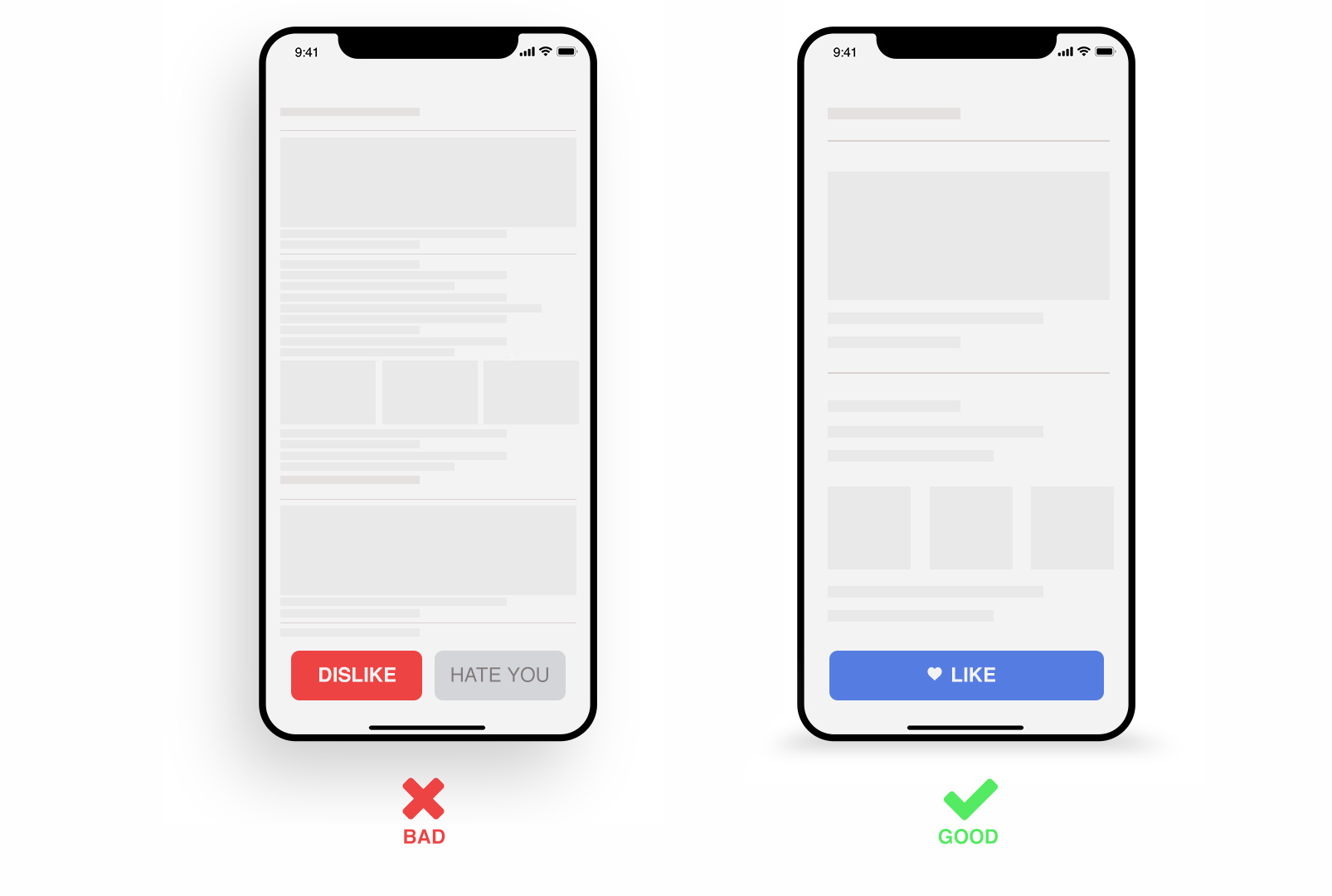
Mistake №4: Using text without buttons
Text buttons with enough interaction space are more convenient and effective for mobile interfaces than just text. This is also true for Material Design. By interaction space we mean not only tactile qualities of the button, but also visual ones. Below are examples of good and bad СТА:
Mistake №5: Not enough «white space»
Use enough “white space” to make your interface appealing to the users. “White space” will make your page look less loaded and will allow you “play” with fonts and design. Pay special attention to indents and space between lines.
Mistake №6: Convoluted and unreadable content
We all know that content is an important element of interface design. This is especially true for mobile versions as small screens make information perception much harder. Choose carefully fonts, sizes, spaces between lines, etc., to make the information readable and clear for the user. Keep the content brief and to the point. Don’t overload it with unnecessary information.
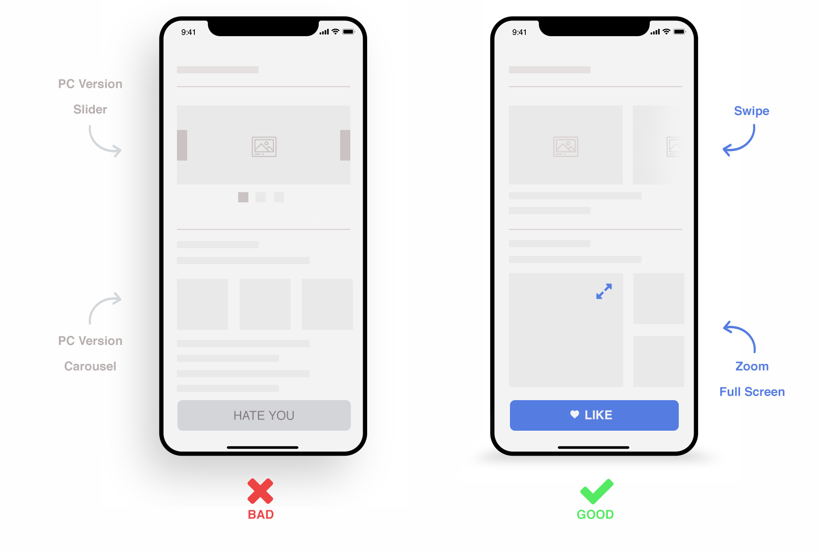
Mistake №7: Ignoring native functions of the mobile device
If you fail to take into consideration the native functions of the device while designing for it, you will get a poor UI and, consequently, negative feedback. Use swipes, multitouching, gestures and other features of mobile devices. Let the end user get maximum of the features.
Mistake №8: Complicated interface
A good UH should have a simple and elegant design. It shouldn’t confuse the user with too many actions on one page. This doesn’t mean you should eliminate all animations and CTA. When used correctly, animations, feedback buttons and other elements can improve UE.
Mistake №9: Unintuitive UX design
Always be very careful when experimenting with UX. Before going for non-standard solutions, make A/B testing to get feedback. Make your ideas intuitively understandable.
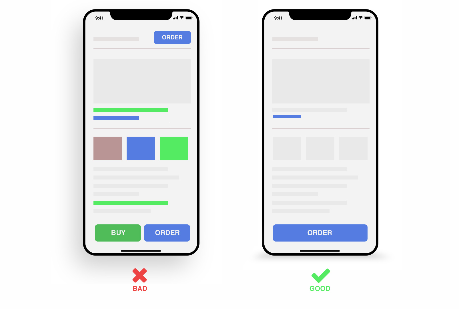
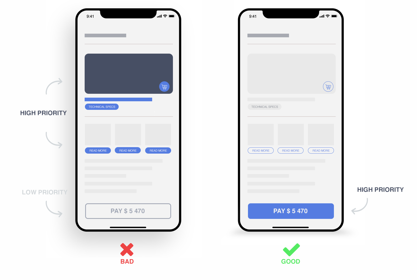
Mistake №10: Unclear UI priorities
Your design should have a visual hierarchy. Highlight the most important elements. Less important information should be less distracting. This will make navigation through your application easier. While designing, you should clearly understand where the user starts and where he finishes.
Wish you have only best interface experience!
Best regards Perfecto Web


 Русский
 English